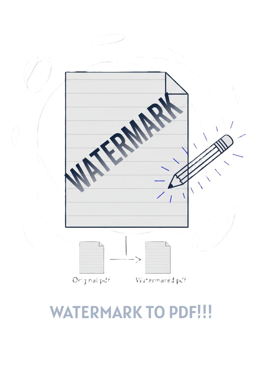
Watermark PDF
Add a see-through text watermark right on every page. It all happens client-side. Your file stays put on your device.
Watermark Your PDFs Brand Protection Made Simple
Need to mark documents as confidential, add copyright protection, or brand your PDFs? The watermark tool we have puts in custom text layers across each page in your PDF. Pick whatever text you want. Set the color. Adjust the opacity. Choose where it goes. Decide on the size. Everything gets handled that way. entirely in your browser with complete privacy.
How It Works
The watermark tool works with pdf-lib. It pulls in your PDF file first. Then it lays down your custom text across each page. You get to pick the spot, the size, the color, and how see-through it looks. All the work gets done locally in your browser using JavaScript. No server uploads, no data collection. You preview the watermark on a canvas, adjust settings, and download the watermarked PDF.
People often think of it that way. Like when you stamp each page of an actual paper document with a see through "CONFIDENTIAL" or "DRAFT" label. The watermark shows up across every single page. Yet it leaves the main content clear and readable underneath. That setup turns out to be just right for marking document status. Or for adding copyright details in the background. And it even works well for simple branding touches.
Why Use This Tool
- Document status - Mark files as DRAFT, CONFIDENTIAL, COPY, or FOR REVIEW
- Copyright protection - Add Company Name or author attribution
- Brand PDFs - Include company name or logo text on distributed documents
- Prevent misuse - Discourage unauthorized copying or distribution
- Professional appearance - Add subtle branding to proposals and reports
Complete Privacy
The PDF file stays right on your machine the whole time. Watermarking gets done straight in the browser with pdf-lib. Nothing uploads to a server at all. That setup matters a lot for handling touchy stuff. Like when you deal with contracts or financial papers. Or legal briefs and reports that need to stay private.
Your privacy really counts here. All the processing happens right on the clients side. Everything stays put on your own device.
There are no uploads to any server at all.
Your document never hits the online world. No kind of data logging takes place either.
We do not get to see the contents of your file or any watermark text you add.
The tool works fully offline too. You can watermark those PDFs without needing an internet connection.
Customization Options
- Text: Enter any text"CONFIDENTIAL", " 2025 YourCo", "DRAFT", etc.
- Opacity: Set from 0.1 (nearly invisible) to 1.0 (fully opaque). 0.2-0.3 works well for most cases
- Color: Choose any color using the color pickerred for CONFIDENTIAL, gray for DRAFT
- Placement: Diagonal (default), center, corners, or custom position by clicking the preview
- Size: Auto-fit (scales to page), Small, Medium, or Large
- Preview: See exactly how the watermark looks before applying it
Watermark Tips
Putting a watermark on something is pretty easy. But making it come across as really professional, that calls for some careful handling. This covers ways to have those watermarks grab attention. They do not take over the whole document.
- Start Subtle with Opacity: People often go with opacity levels around 0.2 to 0.3 when adding watermarks that keep a professional feel. These settings let the main content stay easy to read without any real issues. Going higher, say 0.7 or above, turns the watermark into something that pulls attention away from the important parts. On the other hand, dropping below 0.15 makes it fade so much that it hardly shows up at all. The ideal balance comes through translucency that stands out just enough once someone actually looks for it.
- Diagonal is the Industry Standard: The default diagonal placement for watermarks does more than look appealing. It proves tougher to remove through cropping compared to those in corners or at the center. When a person attempts to crop out a diagonal watermark, substantial portions of the page content end up lost in the process. This explains the common choice of diagonal orientation in most legal documents along with official PDFs.
- ALL CAPS for Visibility: Watermarks such as CONFIDENTIAL or DRAFT stand out much better when they appear in capital letters. That gives them a sense of real authority right away. Lowercase versions tend to fade into the background of the document. This happens especially if you set the opacity low. All caps grab attention instantly. People notice them without even trying.
- Always Test on the Preview: Check the canvas preview with care before putting the watermark on every page. The text needs to come across clearly in that view. It also has to sit in the proper spot without hiding any key parts of the content. Sometimes zooming in helps a lot. Details that seem okay when things are small might end up covering important words once someone looks at the full screen size.
- Color Communicates Meaning: Red often points to something urgent or meant to stay private. It fits right in for labels like "CONFIDENTIAL" or "DO NOT DISTRIBUTE". Gray serves as a solid choice for marking status details such as "DRAFT" or "COPY". That color shows up enough without drawing too much attention. Blue tends to suggest a more official or structured feel. People use it for things tied to company images or copyright details. Selecting the right color calls for some real thought.
- Keep Watermarks Short: Labels should be limited to a maximum of just one to three words. The term "CONFIDENTIAL" works perfectly for marking sensitive materials. A longer phrase like "This document contains confidential information and should not be shared" turns into a cluttered mess on the page. Long text in labels either shrinks down too small for anyone to read comfortably, or it dominates the entire space available. Brevity always comes out on top in these cases.
💼 Common Watermark Use Cases
Watermarks can have all sorts of purposes. It really depends on the goal someone has in mind. The typical situations come up quite often. People handle them in certain ways.
Draft Documents:People sometimes stamp the word DRAFT across pages in a light gray shade. They set the opacity to just 0.25 and tilt it at a diagonal angle. This setup marks the paper as unfinished in a quiet way. It avoids grabbing eyes too harshly or making a big fuss. Such marking fits nicely for passing around early versions of proposals or reports. It also suits contracts that need team checks before anyone signs off on the real thing.
Confidential Materials: People sometimes put the word CONFIDENTIAL right across their documents in red ink. They make it faint at about 0.3 opacity and angle it diagonally for that watermark look. The red stands out enough to warn folks about sensitive material inside. It prompts anyone opening the file to treat everything with real caution. This approach fits nicely for handling financial records, human resources papers, or key business planning docs.
Copyright Protection: Put something like "© 2025 Your Company Name" right there on the page. Make it in gray or maybe blue, and keep the opacity down to about 0.2. That way, it stays subtle enough not to mess up the look. But it still gets the point across clearly about who owns the stuff. This kind of thing really helps cut down on people grabbing and sharing without permission. Plus, it just makes ownership obvious to anyone glancing at it. You can use this approach in white papers or guides. Or really any content that goes out to the public.
Review Copies: People often mark drafts with "FOR REVIEW ONLY" or "COPY" in gray at 0.25 opacity. That setup makes it clear the PDF is only for feedback purposes. It is not ready for final distribution at all. Nobody should mistake it for the official version.
Pro tip: Watermarking several documents at once often involves a shared goal. Take marking 20 reports as confidential, for instance. In such cases, recording the chosen settings proves useful. These include the specific text, the color selected, the level of opacity, and the exact position on the page. Applying them uniformly to every file follows naturally from this step. Documents then present a more professional appearance overall. They seem organized too, which matters in professional contexts like legal reviews or corporate sharing. Evidence from document management practices supports this approach. Consistency reduces errors and builds trust in shared materials.
Quick Guide
- Upload your PDF: Click or drag your file into the upload area
- Enter watermark text: Type your desired text (e.g., "CONFIDENTIAL")
- Set opacity: Adjust 0.1-1.0 (0.2 recommended for subtle effect)
- Choose color: Use the color picker to select watermark color
- Select placement: Pick diagonal, center, corner, or custom position
- Preview: Check the canvas to see how it looks
- Apply watermark: Click the button to process all pages
- Download: Save your watermarked PDF!
Frequently Asked Questions
Can I add different watermarks to different pages?
This tool does not currently support different watermarks for each page. It applies the same one across the entire document. For page-specific watermarks, the process involves splitting the PDF into sections first. Then each section gets its own watermark added separately. Finally, all the parts come back together as one file.
Does the watermark affect PDF quality?
No. The watermark is added as a text layer on top of existing content. The original PDF content (text, images, vectors) remains unchanged with no quality loss.
Can someone remove the watermark?
Technically, yeswatermarks are not encryption or security features. They're visual deterrents and indicators. For true document protection, use password protection or encryption instead.
Can I watermark password-protected PDFs?
If the PDF requires a password to open, you'll need to unlock it first using our Unlock tool. Once unlocked, you can add watermarks, then re-protect it with our Password Protect tool if needed.
What's the best opacity setting?
For most professional documents, 0.2-0.3 works wellvisible enough to read but subtle enough not to distract. For very light backgrounds use 0.3-0.4; for dark backgrounds try 0.5-0.6 with white or light-colored text.
Can I use special characters or emojis?
Standard text and common symbols (, , ) work reliably. Emoji support depends on the PDF viewer and font embedding. For maximum compatibility, stick to alphanumeric text and standard symbols.